At a glance: Website, logo and branding guide


Contents
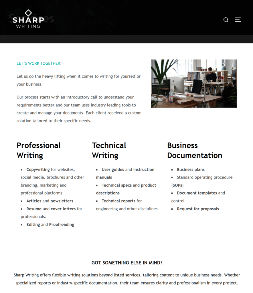
Sharp Writing: Writing agency web design and brand identity
Sharp Writing provides professional copywriting and content services. They needed a brand that reflected their name—clean, direct, and highly effective—allowing them to stand out as a premium service provider in a crowded digital landscape.
The objective
The primary goal was to keep things incredibly simple and “sharp.” Sharp Writing required a digital presence built from the ground up that delivered their core messaging rapidly, without overwhelming the user with unnecessary fluff.
Our approach and design
We started with complete brand identity and logo development. The driving concept was creating a sharp, striking logo that could stand entirely on its own without relying on typography. Once the logo was perfected, we developed a comprehensive branding guide. To strike the perfect balance between authoritative professionalism and approachability, we utilized a crisp black and white foundation, accented by a highly unique, modern turquoise.
The highlight: high-performance UX and automation
The new site needed to be lightning-fast, highly responsive, and visually engaging. We implemented several advanced features to elevate the user experience:
- The “executive summary” sidebar: Recognizing that B2B buyers are often in a hurry, we engineered a unique custom sidebar designed specifically to summarize the website’s core offerings for fast-paced viewers.
- Dynamic video headers: We added instant visual engagement at the top of the funnel to capture attention without sacrificing core page load speeds.
- Automated intake forms: We integrated smart, automated workflows into the site’s architecture to streamline client inquiries and instantly route project details to the Sharp Writing team.
The result
A visually striking, cutting-edge digital platform that perfectly captures Sharp Writing’s unique voice. The cohesive branding ensures they make a memorable first impression, while the custom UX elements and automated backend forms actively work to convert high-value leads with zero friction.
Ready to build a digital presence that works as hard as you do? Explore more of our recent projects in our featured work, read our latest web design and local SEO strategies on the blog, or get an immediate estimate for your own build using our instant quote tool.