
Contents
TL;DR
Wondering why mobile friendly websites in Winnipeg matter more than ever? If your site forces mobile users to pinch, zoom, or wait through endless loading screens, you are actively driving customers straight to your competitors. At kreativekabbage, we don’t just shrink desktop layouts; we engineer high-speed, app-like mobile experiences with swiping cards, interactive elements, and lightning-fast custom code. Discover why mobile optimization dictates your local search rankings in Winnipeg and beyond.
Mobile friendly websites in Winnipeg
When local business owners sit down to plan a new website, they almost always review the design on a massive 27-inch office monitor. It is completely natural as that is where we spend our working hours. But there is just one tiny flaw in that approach: your customers aren’t always browsing your services on a desktop setup while sipping coffee at a desk.
They are pulling out their phones in the parking lot, looking for an emergency service on Portage Avenue, trying to book a quote while standing in a kitchen in Winnipeg or trying to show something they came across to a friend on their phone while running a red light at Regent Avenue (don’t quote us on that).
At kreativekabbage, we see it all the time. Business owners treat their mobile view like an afterthought, assuming that as long as the site shrinks down, the job is done. But mobile optimization is no longer just a nice-to-have feature; it is the absolute core of modern search visibility and conversions. Let’s break down why mobile friendly websites matter more than ever.
The tiny screen reality check: thumb fatigue and slow loads
Think about how you behave when you are searching for a local business on your phone. If a website takes more than a few seconds to load, or if the text is so microscopic that you have to pinch and zoom just to read a phone number, you bounce immediately.
According to global web traffic reports tracked by platforms like StatCounter Global Stats, mobile devices account for the overwhelming majority of day-to-day web browsing. When a website features heavy, unoptimized elements, users experience severe thumb fatigue from endless scrolling through cluttered, poorly stacked desktop columns.
As we explored in our guide on why you must invest in your small business website in 2026, treating a mobile screen like a compressed desktop brochure is a recipe for a high bounce rate and lost revenue.
Why standard DIY builders fail the mobile test
Most off-the-shelf website builders claim to be “responsive,” but what they actually do is take a wide desktop layout and stack every column vertically on top of each other. The result? A single, mile-long column of text, images, and forms that feels exhausting to navigate.
Usability research by organizations like the Nielsen Norman Group on mobile usability shows that mobile users demand extreme efficiency. They want to see what they need first, and they want calls-to-action to be instantly accessible without hunting through a maze of menus.
When clients ask us why their current site isn’t generating leads, a quick audit using Google PageSpeed Insights almost always reveals sluggish mobile loading times and broken touch targets. It directly mirrors the warning signs we outlined in 10 signs it is time for a new website.
How we engineer app-like mobile experiences
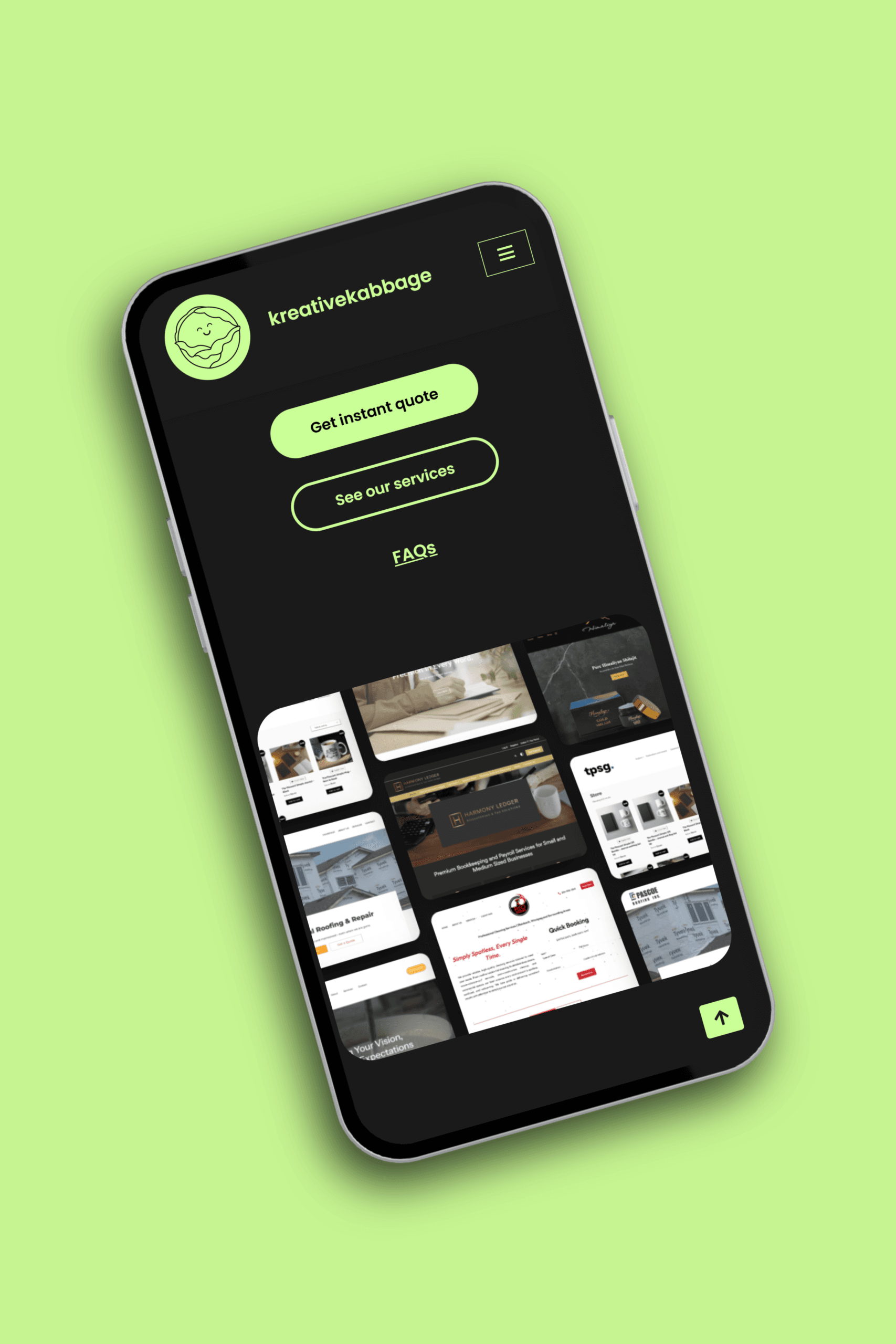
At kreativekabbage, we take a completely different approach to mobile design. We don’t just shrink your desktop site. We engineer an experience tailored specifically for a 6-inch screen.
Here is how we bring app-level performance to your mobile visitors:
- Swiping cards and interactive elements: Instead of forcing users to scroll through endless vertical walls of text, we utilize smooth swiping cards and interactive columns that expand only when tapped. See example: Southeast Shuttle
- Dedicated mobile architecture: Some complex tools require a totally different layout on a phone. For instance, a sprawling desktop dashboard transforms into a compact, streamlined view or a sticky floating action bar on mobile. See example: Harmony Ledger
- Zero plugin bloat: By writing clean, custom code instead of relying on dozens of heavy third-party plugins, our mobile builds load instantly, even over standard cellular data connections.
This philosophy is baked into every project we touch, echoing the principles we discussed in beyond the brochure: website design Winnipeg businesses actually need.
The google and search engine verdict
It is often difficult to convince business owners of the technical backend requirements, like why web crawlers care so much about mobile code. But when we point out that Google’s mobile-first indexing guidelines mean search engines judge your entire business based solely on your mobile version, the penny finally drops.
If your mobile site is clunky, Google assumes your user experience is poor, and your local search rankings drop accordingly. Pairing a flawless mobile structure with the foundational advice in the Google Search Central SEO starter guide ensures you capture high-intent local traffic.
Whether you are looking for comprehensive website maintenance services or a brand new build, your digital footprint needs to shine on every screen size.
Ready to give your mobile customers a seamless experience?
If your current website looks great on your office monitor but feels like a frustrating puzzle on a smartphone, it is time for an upgrade. Don’t let clunky mobile design lock your business out of the local market.
Explore our services to see how we build lightning-fast web applications, or head over to our contact form to map out your next project with total pricing transparency. Let the team at kreativekabbage make your website work brilliantly, wherever your customers are scrolling!